-
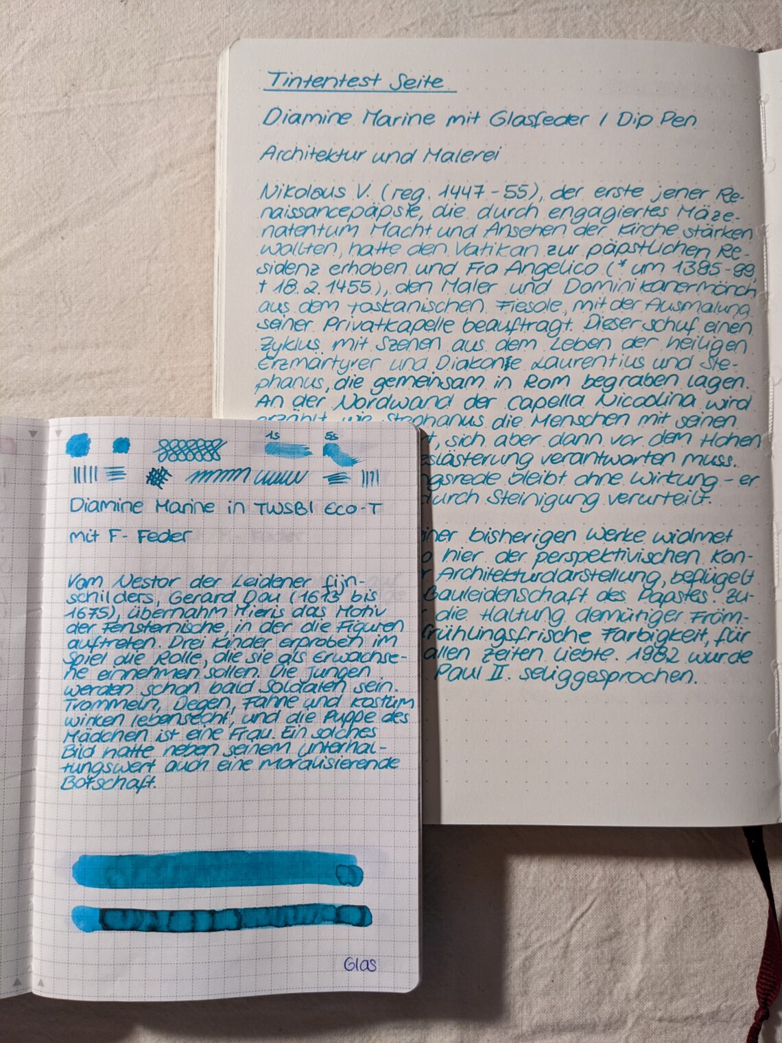
Diamine Marine
This color is a bright teal, turquoise or sea blue. It reminds me a little bit of the stone turquoise, although the color is a little bit darker. I’d say its a blue tone with a little bit of green inside. While writing on my Tomoe River Paper you can see a little bit of shading, the differences between the lighter and the darker parts of the lines is less prominent than in other inks. I was surprised to see a little bit of red sheen in the swatch on the bottom of the page. It is not visible in the written text passages. On Leuchtturm 120gsm paper, where I…
-
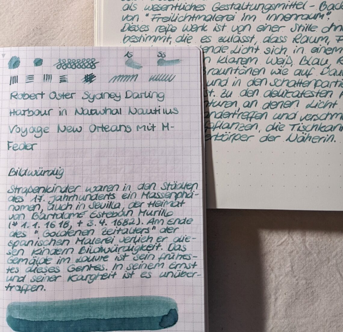
Robert Oster Sydney Darling Harbour
The color changes between dark green, grey green and blue green. I’d describe it as blue green. It’s a beautiful ink with a lot of shading, the flow is rather wet. I didn’t have any problems writing with this ink, also there haven’t been any things like crumbs, pigments or glibber in the ink. As you can see there is a lot of shading going on in this ink. It’s a rather light ink apart from the darker pools. It may be too light for some people on white paper. The shading is less prominent on Leuchtturm Paper and the whole writing looks a little bit calmer. The lighter parts…
-
Ink Reviews coming!
Hei there it’s me again! I’m still bullet journaling – in a way. I have a new addiction meanwhile: fountain pens and awesome inks. Shortly after my last post I started using fountain pens again and bought a bunch of awesome inks. I feel like I’m always using different colors than most of the people out there, so I’m gonna share my experiences on my homepage now. Feel free to comment on the inks, maybe you tried one already?